Designing for Personalization
As users, we expect our modern digital products to understand us more thoroughly - to help drive a more seamless, personalized experience per our individual preferences. We see this in a multitude of ways, across mobile apps, websites, and even (more so) in our content streaming experiences:
- Custom app icons
- Personalized ecommerce recommendations
- Categorized TV shows and movies
- Dark / Light modes
Neilsen Norman Group summarizes the difference between customization and personalization fairly well:
Customization gives control to the user and personalization gives control to the site. Both can enhance users’ experience, but only when carefully implemented.
Customization vs. Personalization in the User Experience
Personalizing Experiences
The basic goal of personalizing an experience is to prevent users from struggling to find information / content / products. Personalization is a way for a product to identify an individual and help build relevancy to the things they see and the options they have. How can we show our users things we think they might prefer from the sea of content that we host on our platform?
What are the goals of building personalization in a product and why does it matter?
- Build loyalty from individuals in a user pool
- Decrease content noise for users
- Increase product engagement/retention
- Increase upselling of similar goods
Most goals around personalization revolve around increasing conversion rates and retaining a more loyal user. Experience personalization has greatly influenced the way we shop for things and consume content in the modern era. We're seeing how detailed metadata associated with individual products, movies, podcasts, music, etc. is being used to categorize things the way systems assume we, as individuals, prefer.
What kind of things can a product use to categorize individuals? We actually see quite a bit of personalization being used across the modern web:
- Geolocation/geofencing
- Profile information
- Survey results
- Referral links and campaign source
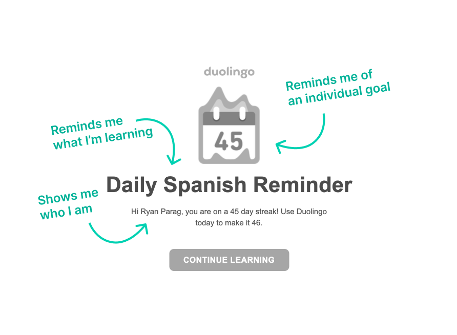
Even by using these basic data points, systems can automatically sort users and gauge common content when paired with a machine-learning/big data platform. Some of these data points are given from an individual's self-identification, whereas some of the more complex forms of identification are based on what and how a user consumed particular content (eg. I watched a sci-fi movie on Netflix, so the system recommends more sci-fi movies in my feed).
We can take a quick look at how Duolingo is using a mix of identification data to help build engagement through simple email updates:
Let's take a look at how Netflix shows us things based on the things we've previously watched and our individual user profile:
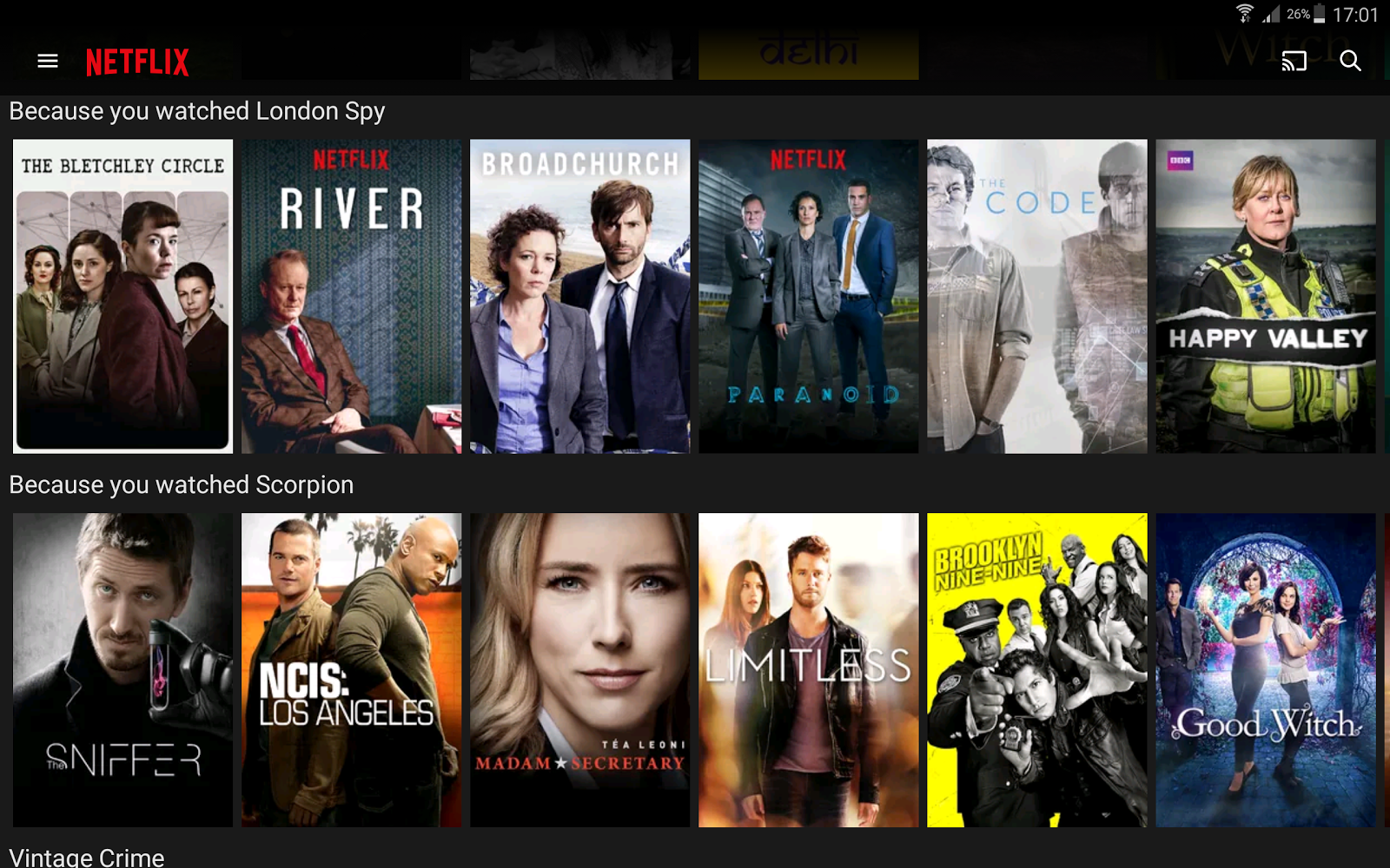
Netflix is also A/B testing on top of this, driving their deep learning platform and content designers to learn how and why certain users choose particular UI cards:
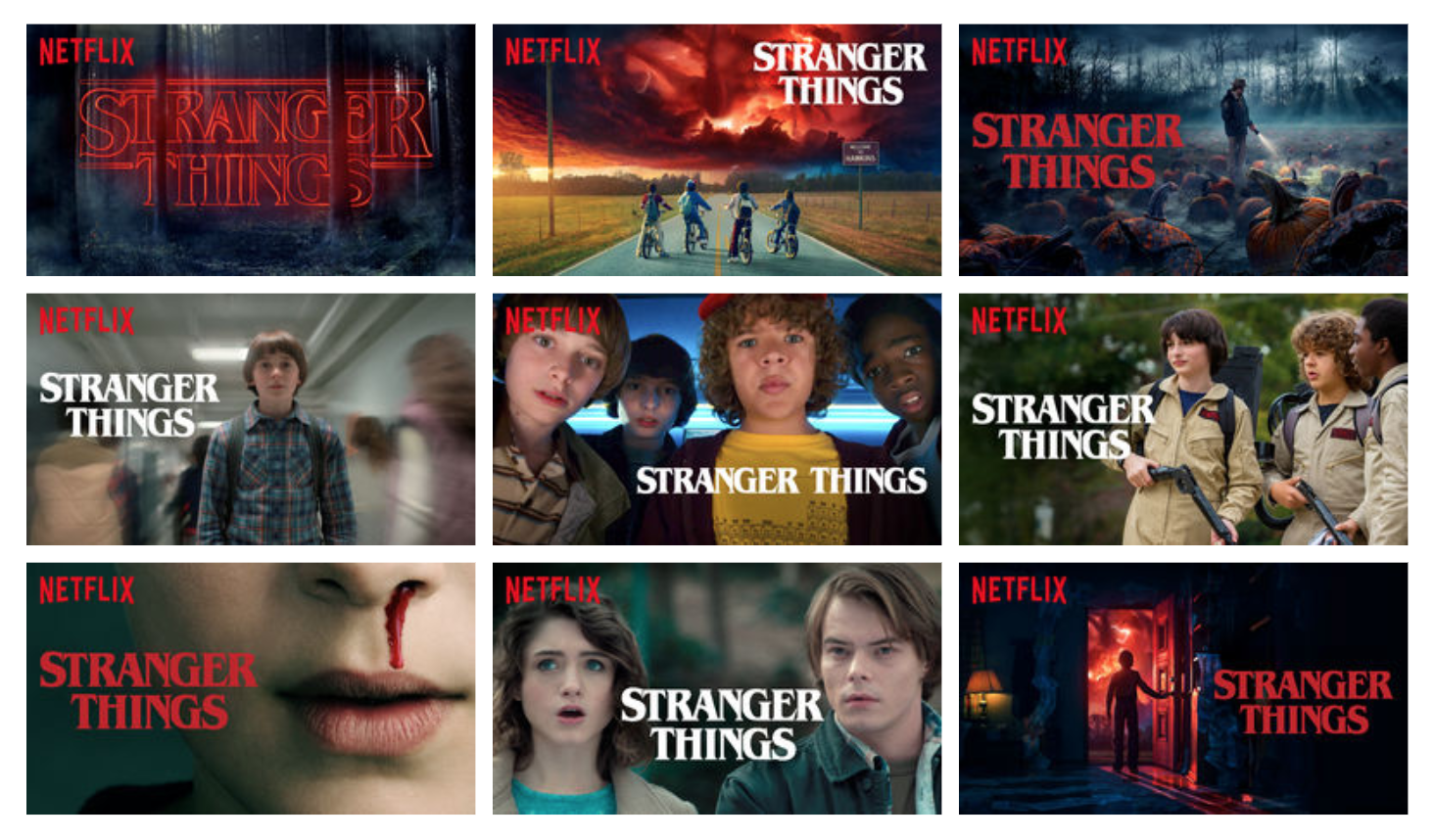
In these examples, we're seeing how designing the system to perform certain background tasks can help provide a more personalized experience. Even though Netflix's example is a very complex model, I think the starting point of how to design around personalization begins with a few basic questions:
- Who are our users?
- What do we know about them?
- What and how can we learn about them?
- What data can we sort for them based on what we know about each user?
- How do we show them this sorted data?
- How do we measure the success of "smarter" sorting?
Let's take a look at how Spotify answers those questions and opts to show users recommended content:
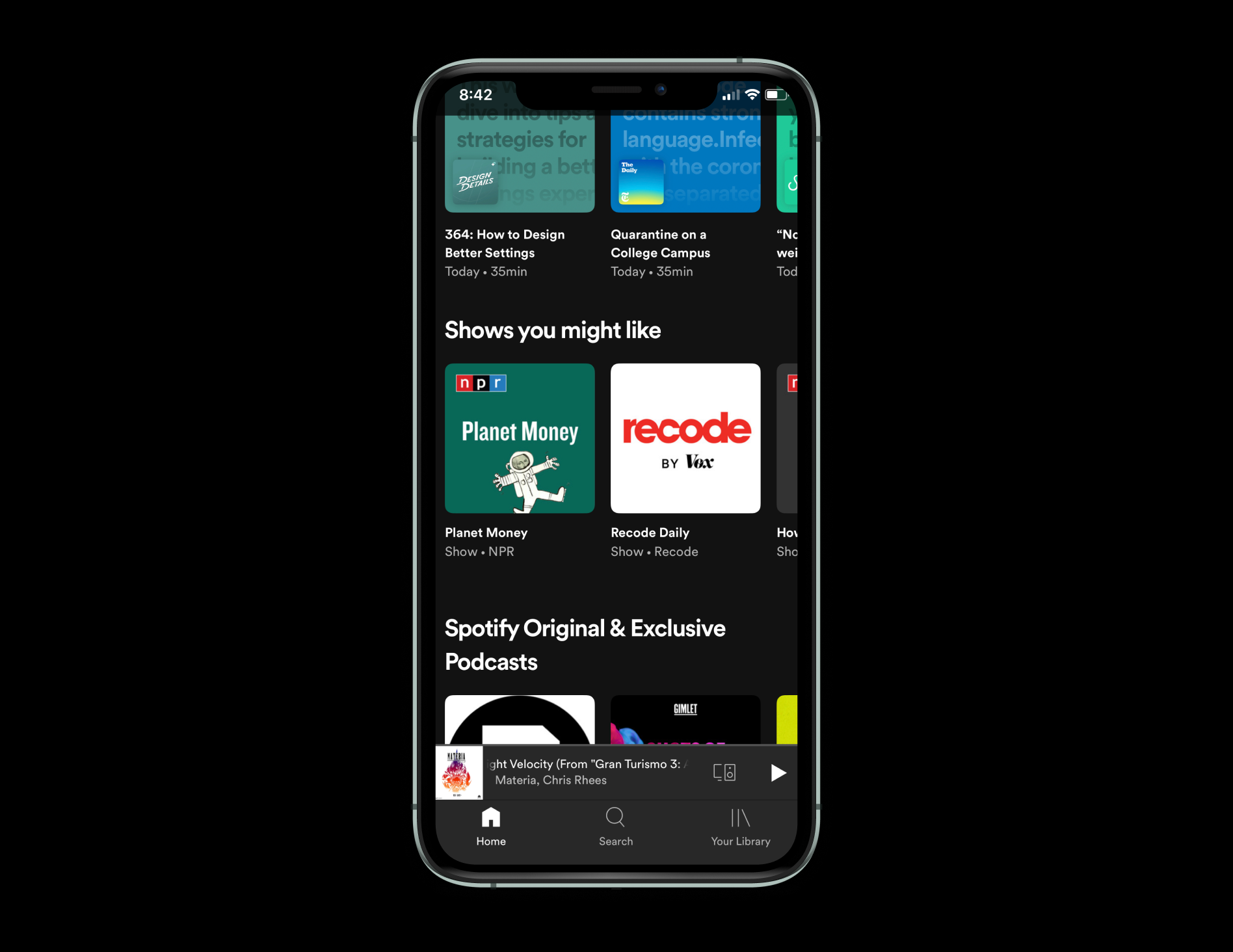
Spotify also chooses to mix content together, showing us a variation of content we've consumed alongside content that matches a higher frequency of metadata - all pointing to a more seamless, personalized experience.
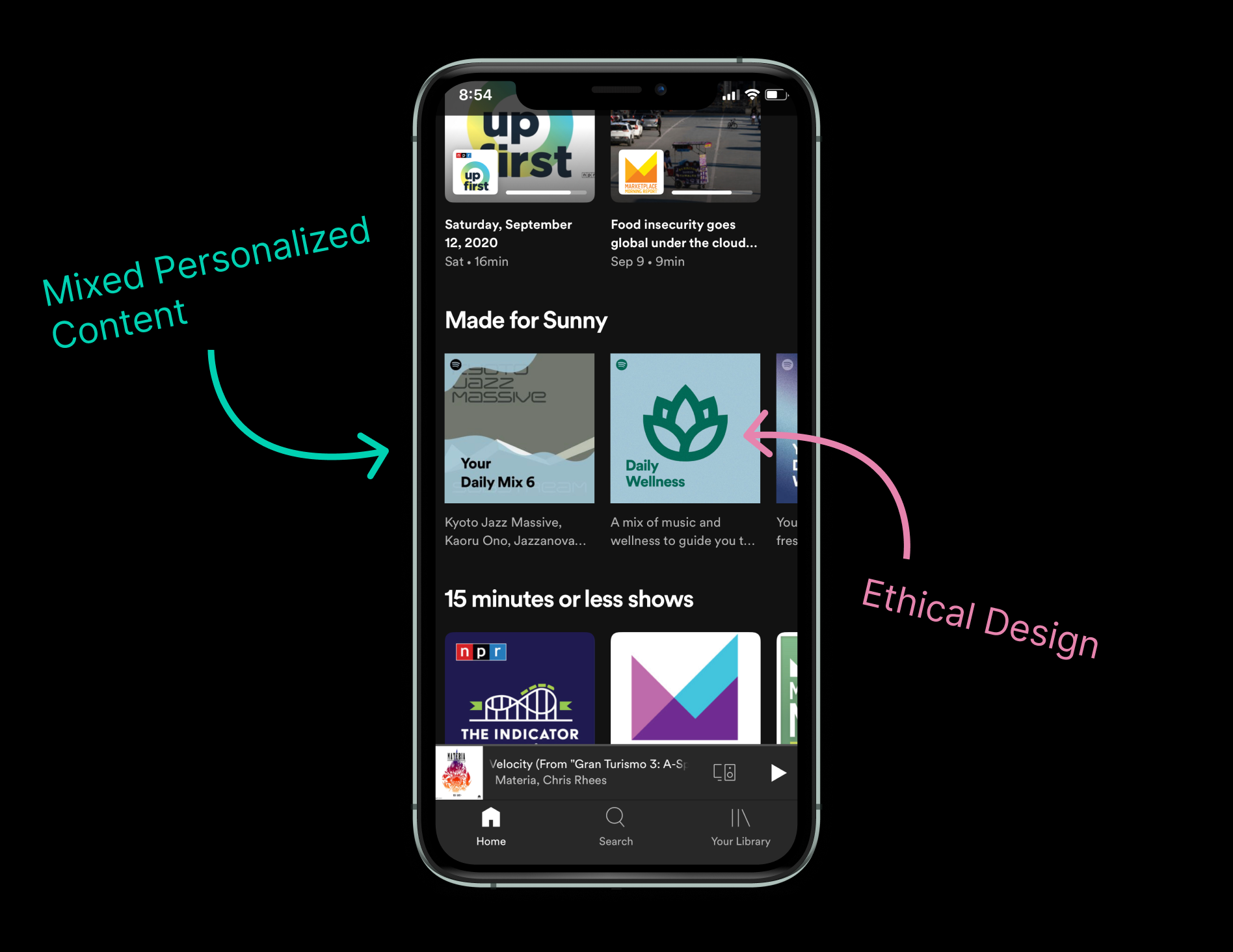
This is a super interesting method of designing for a better experience, and can probably be expounded on greatly. Here are a few more resources digging into these details more thoroughly:
- UX Design for Personalization
- Artwork Personalization at Netflix
- Amazon’s User Experience: A Case Study
- UX in the Age of Personalization
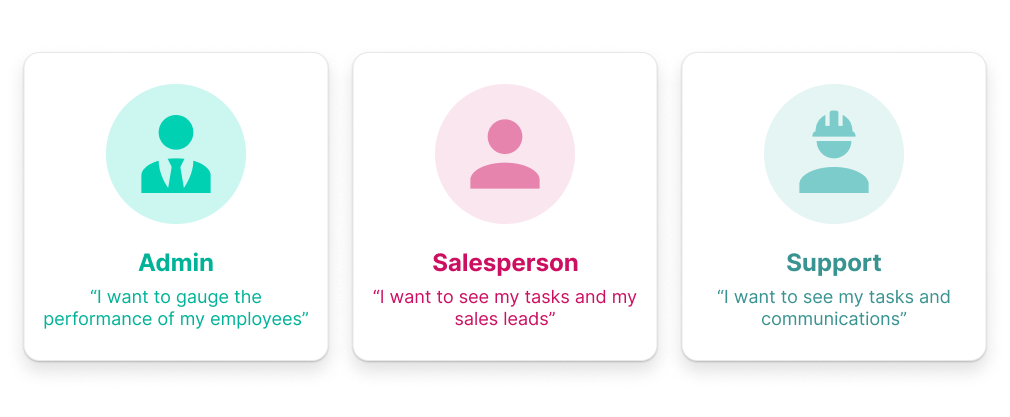
We also see personalization across many of our products that enable the way we work - usually distributed across different roles/permissions contained in a system. For instance, admins on a platform may have more functionality in the things they are able to do, more so than normal users.
In the example below, we can see a handful of example roles in a system and the different goals associated with each. Each goal can be mapped to drive a particular experience - whether that means surfacing particular actions or altering a view dependent on that role/goal.
Customized Experiences
Rather than let the system dictate what a user sees, is it possible for us to let the user dictate their own experience upon segments of a digital product experience?
We see this in a ton of ways already - throughout our iOS settings, news feeds, theme pickers 😉, etc. Personalizing an experience based on the user's set preference can allow the user to accommodate themselves to a product more effectively - they would be situating themselves to an environment more relevant to their types of engagement.
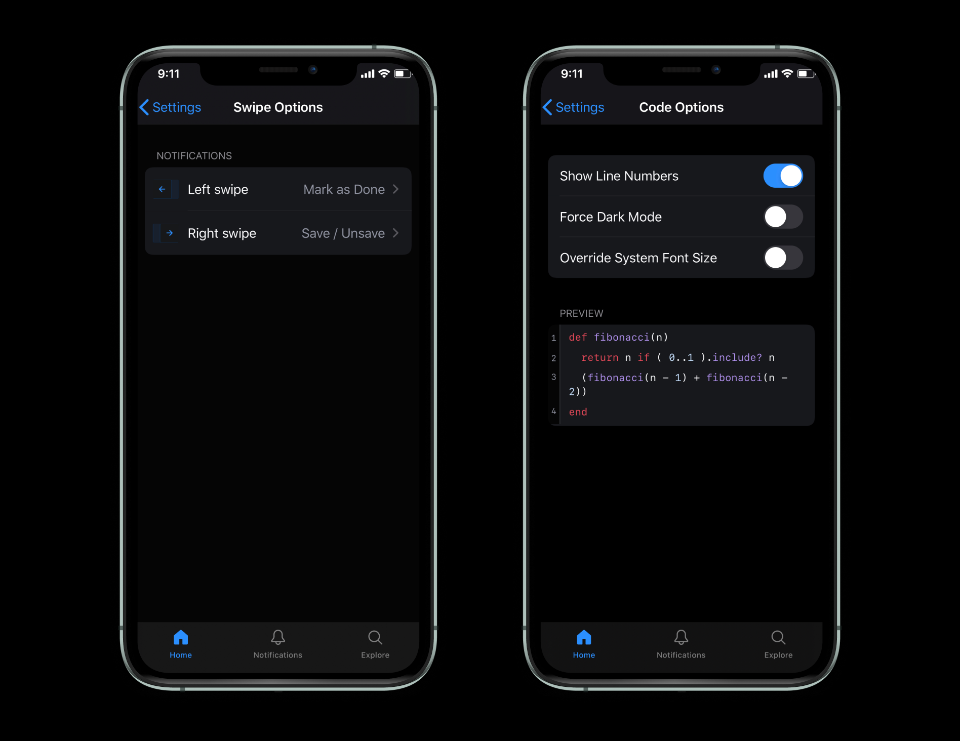
Let's take a look at how some teams are tackling customization in a few unique and common ways. In GitHub for Mobile, we can see a wide range of ways they're allowing the user to customize based on their preferences - providing fixed options to modify certain settings:
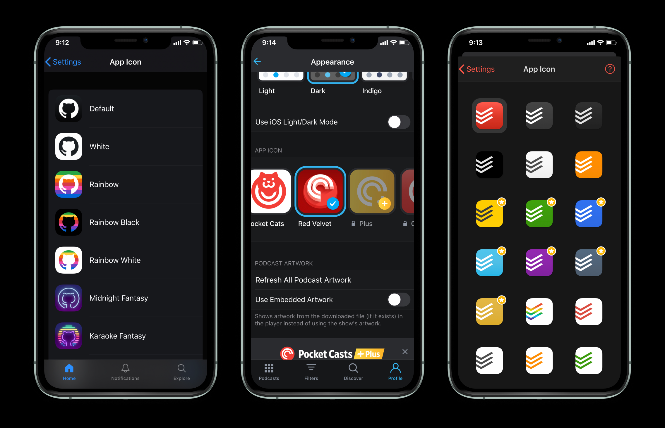
Some apps even let us choose the app icon we see in our view, before we jump into the app! Let's see how GitHub, PocketCasts, and Todoist gives users an array of app icon options:
One of the most common ways digital products give to customize the UI and experience for individual users is through dark/light theming (and maybe a step further). Commonly dictated based on the user's OS settings, apps and browsers can grab and feed that preference to our digital products - building a sensible default and predicting a more seamless experience for the user.
If you'd like to do this on the web, all it takes is a bit of CSS or JS. If you're opting to do this in CSS, we can accomplish this in a simple way in modern browsers:
@media (prefers-color-scheme: dark) {
  body {
    color: white;
    background: black;
  }
}

@media (prefers-color-scheme: light) {
  body {
    color: black;
    background: white;
  }
}
In JS, we can grab a user's OS theme with a simple function:
if (window.matchMedia &&
    window.matchMedia('(prefers-color-scheme: dark)').matches) {
  document.body.style.background = 'black';
  document.body.style.color = 'white';
}
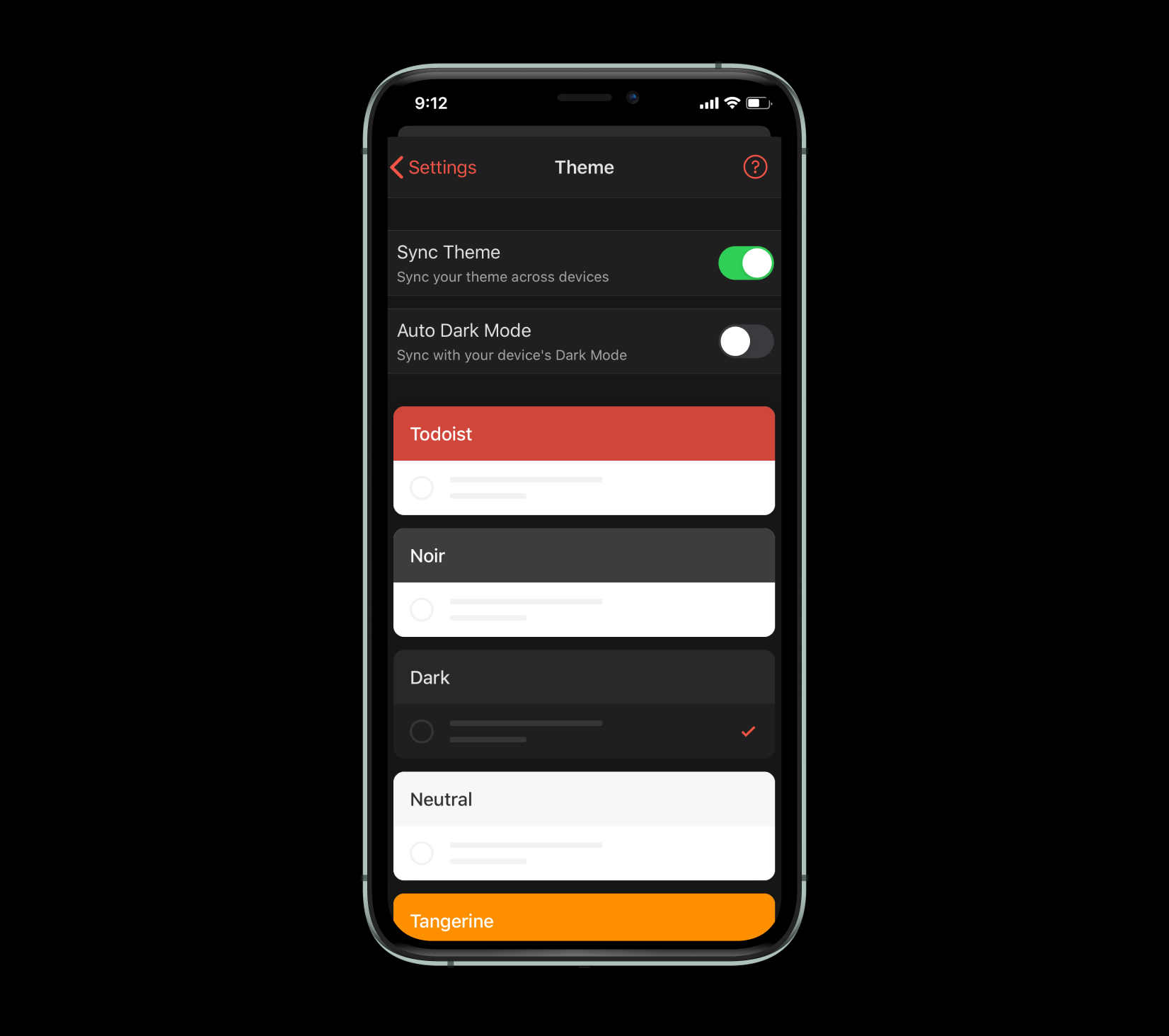
Some apps take this to another level, giving users options in choosing pre-selected themes (kind of like this site). Todoist lets users select a theme and which type (light/dark) of neutral colors they prefer. They even let the user toggle if they would like to match per their OS preferences and make a more cohesive cross-platform experience by syncing:
A Step Further
UI personalization and customization has made me curious on the limits to which we can go by giving users certain controls - and, more interestingly, when we don't have to. Most UI theming mechanisms provide a limited, strictly-defined amount of choices (as seen above). What if we could give users full control of the theme in an interface?
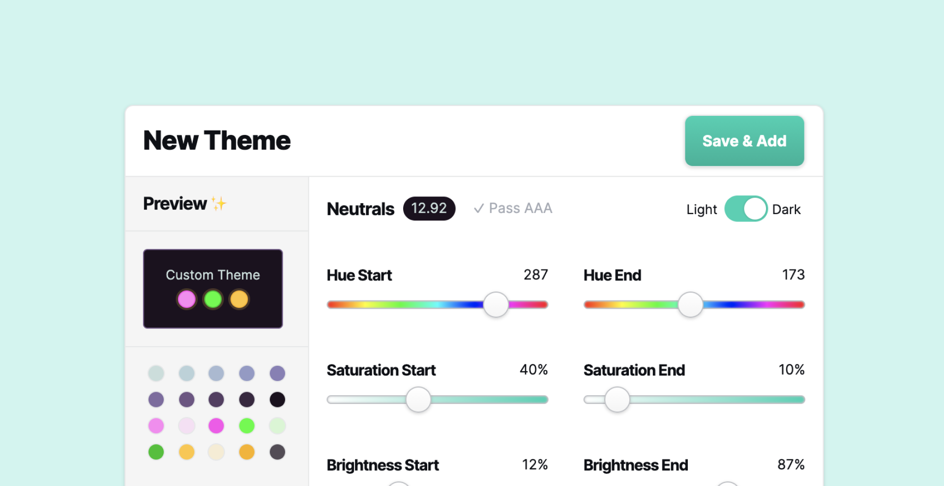
So I created a way for users to theme this site on their own. Check it out!
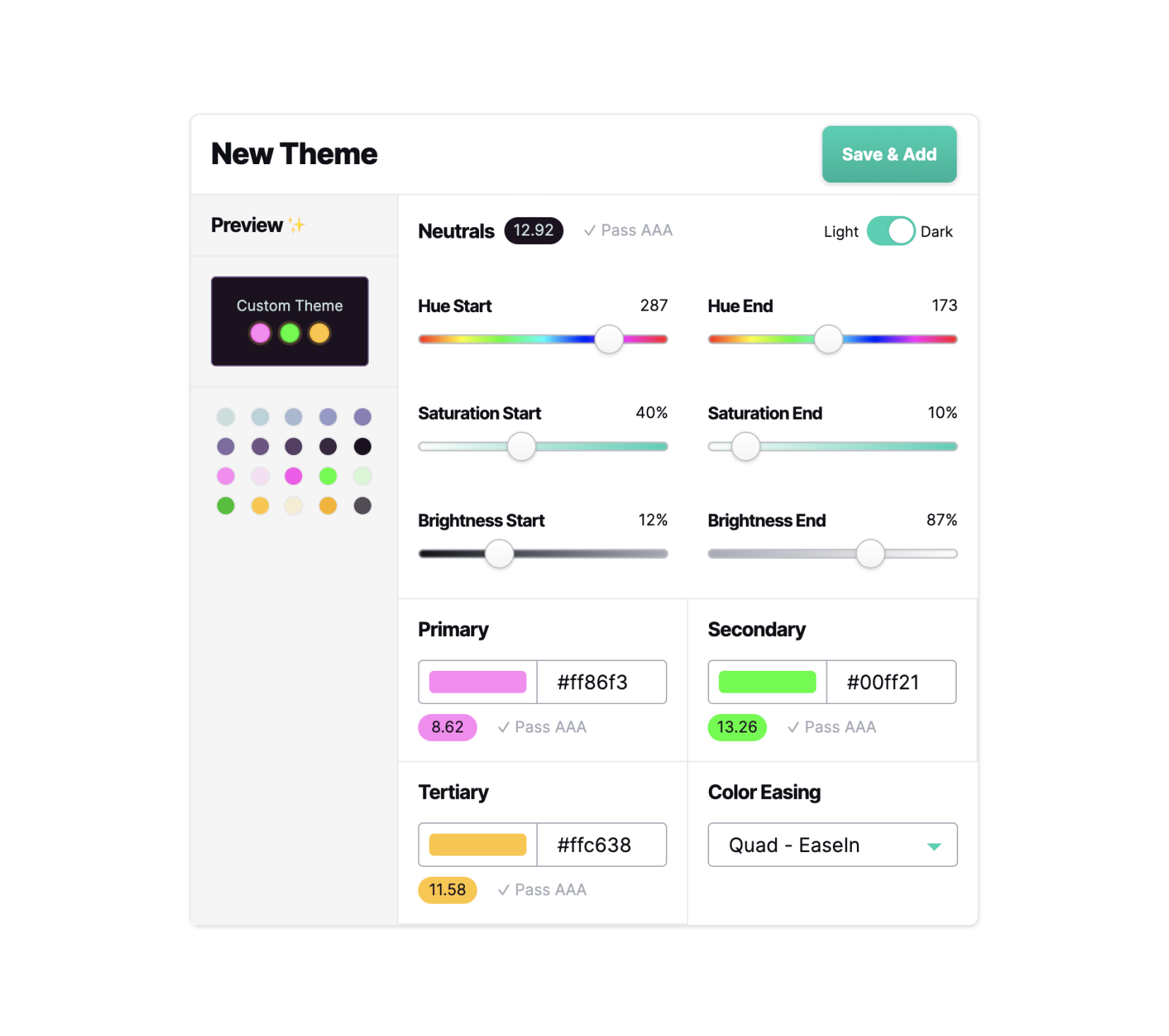
I've been experimenting with ways to which we could give users fluid customization abilities, but provide them enough rails as to not degrade their experience.
I'm still playing around with this idea and gathering feedback, but by using Lyft Design's Colorbox tool and the algorithm they've crafted, we can create palettes on-the-fly using minimal inputs.
To provide some rails for the user, I included a way to gauge when parts of the theme aren't matching certain WCAG requirements as well.
I'd love to hear what you think, and if you have any feedback contact me using the details below!
