Thoughts on Design Tools

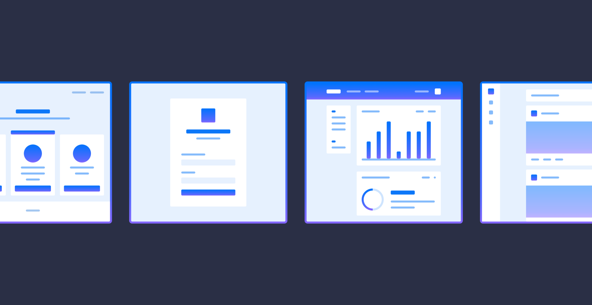
Illustrations from Lattice's Simplified Wireframes
🔥 Hot take 🔥 - just kidding. I want to preface this post by saying that the opinions below are just my current thoughts and my main goal in this was to think out loud. I mainly wanted to promote discussions about how others may feel about this - especially from designers from various team structures.
If you've been keeping up with these posts chronologically, I've mostly been writing about the more pragmatic aspects of design. For this note, I thought to take a more introspective, cathartic take on things that I've been thinking about.
As designers, we've seen an era of innovation in our design tools recently - tools like Sketch, Figma, Adobe XD, Framer have transformed the way we share what we design. These innovations have also spurred debate in design communities around being "the best design tool" - sometimes where we tie ourselves to a particular tool, rather than why we're using a design tool.
Are we evaluating what was built?
We share mockups and prototypes often - in our portfolios, Dribbble, Twitter, Slack workspaces, etc. But from those designs, what are we actually shipping? What was the end result of that design after it goes through development and the gamut of unhappy paths that often happen?
Many times, we even share designs that may be slightly different in actuality - due to something that may have popped up in QA or an error state that alters a bit of the user flow.
"What you deliver matters - you are what you ship"
An analogy would be if we were to only evaluate an architect's sketches rather than the structure that was built. Shouldn't the same be true of product designers? Shouldn't we critique our shipped end result and not just the Figma prototype alone?
So what is the purpose of a design tool for us?
Don't get me wrong - I still think design tools like Sketch and Figma should be fundamental to our process. They allow us to iterate on workable solutions and share our ideas quicker for validation.
Maybe the purpose of the design tool is to help our teams better communicate what we're setting out to build - helping surface things with the appropriate team members:
- if we're on target for our business goals with our PM's
- if we're meeting engineering constraints from developers
- if our experience is meeting our design goals
What is the best design tool?
In my opinion, I don't think it matters. I think what we all want is to be able to design as close as we can to an end result - interactions, dynamic data, error states, statefulness, etc. - all to help communicate the experience we want to design to our stakeholders and teams. If this can be done in Figma - awesome! If this can be done on a sheet of paper and you're working within an established design system - also awesome! Whichever tools helps align your team most thoroughly and efficiently is probably the best tool for you.
I think what might be the most important factor to consider is how your team works and which tool helps us communicate over the designs for our product most thoroughly.
Learning how we can better communicate our ideas through a design tool can help us align to what ends up as the shipped result. Balancing time and engineering constraints in this phase, along with talking through the unhappy paths can help us make our Sketch files look more like our end results.
Maybe this means accounting for small front-end constraints while we're dragging rectangles around? Maybe this means thinking about our timelines and roadmap while we're working in Figma? I don't know, but I'm curious to figure out how we can use design tools to better align with our teams, and help us have a clearer picture of what will end up as the end result of our design.
Maybe all of these concerns can be answered in learning when to use a particular tool:
- I need to visualize a few layouts - "Sketch?"
- I need to test a certain user flow - "Figma?"
- I need to test an interaction - "Code?"
This method also means we have to remain flexible in our skillsets.
What works for me, currently
I'm not sure I have the answers to the things I've been thinking about - but currently, tools that allow me to work faster / align in higher frequency / communicate more meaningfully, help me surface these "real world" issues sooner and more frequently. Even more helpful for aligning engineers on my current team is documenting and sharing the design doc of why we're setting out to incorporate a new design - essentially a case study for each feature design.
With the innovations in no-code tools, and even the development of accessible code (React, SwiftUI, Flutter), we're inching closer and closer to the day where design and engineering are closely speaking the same language - maybe we're already there on teams that have a high degree of fluidity and t-shapedness.
To be honest, I feel we're still far away from the day where we can design an end result directly from a design tool - so the problem we're left with is how we can better surface core problems from our users and communicate through ambiguity with the engineers/PM's on our teams. How can we learn to use our design tools to better communicate the "why" and "how" when we're in the build phase? How can we receive more thoughtful "buy in" from our team members and stakeholders?
I'm on a neverending journey on trying to figure this out for myself and how I work, so I'll probably revisit this note and make revisions. But I thought it would be helpful to at least share what was on my mind and what my process looks like from a high level. I'd love to hear your thoughts on design tools and how you feel they're used best - send me a message!
